Born to Run Revisited. The limited edition book from Ormond Yard Press.
Ormond Yard Press: Bringing you the bigger picture.
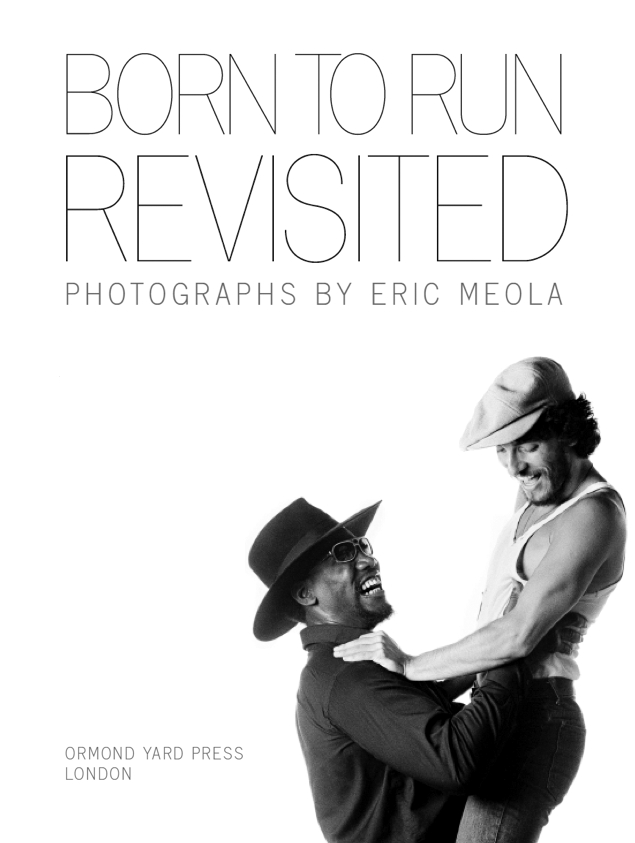
Born To Run Revisited, with photographs by Eric Meola, is the inaugural publication from Ormond Yard Press. It is the first in a series of large format limited edition volumes which will focus on key moments in the history of popular culture, and give them the epic treatment they deserve.
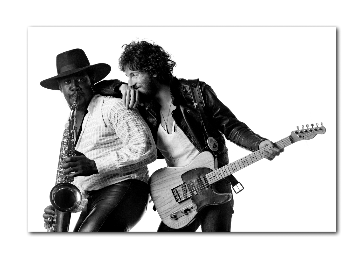
Eric Meola’s work needs little introduction to any student of popular music. He created one of the most recognisable images in rock ‘n’ roll: the 1975 photograph of Bruce Springsteen and Clarence Clemons that appeared on the cover of Born To Run. We hosted the world’s first gallery exhibition of Eric’s Bruce Springsteen photographs in 2006, and we are hugely proud that he has agreed to be the subject of our first title.
Born To Run Revisited is a book on a spectacular scale: a hardcover volume housed in its own printed slipcase and measuring 24 inches high x 18 inches wide (60x45cm) when closed, 24 x 36 inches (60 x 90cm) when open, with 96 pages of photographs, adn an introductory essay by Eric Meola. The physical scale may be large, but the edition size is reassuringly small – just 500 individually signed and numbered copies are available to collectors worldwide.
What’s the big idea ?
For some time now, I’ve believed that something was missing from traditional photo book publishing. An itch became a scratch that became an idea, that now, I’m delighted to say, has become a beautiful, tangible book: Born To Run Revisited, with photographs by Eric Meola.
Born To Run Revisited is an ultra large format hardcover, with 96 pages, and a new 2,000 word introductory essay by Eric Meola. When closed, the book measures 24 inches high x 18 inches wide (60x45cm). A double page spread measures 24 inches high by 36 inches wide (60cm x 90cm). That’s a vast scale in anyone’s language. Just get out your tape measure and plot out 24 x 36 inches (or 60cm x 90cm). Now visualise a double page spread this size, carrying a single image in pin sharp detail. You will need your tape measure though – a ruler won’t be big enough.
Why is this book important? Because something revelatory happens when a photograph is presented in a very large format: hidden details come to light, and the power and impact of the image are magnified exponentially. Unless you go to a gallery and see a large format print on the wall, you can’t experience this. That’s where we come in. Ormond Yard Press has been established to publish a carefully curated series of spectacular large format limited edition photography books that package the essence of large format gallery exhibitions, without reducing the impact of scale. Imagine an entire art gallery exhibition that you get to take home and keep forever.
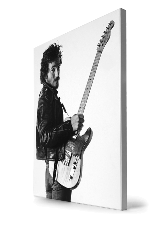
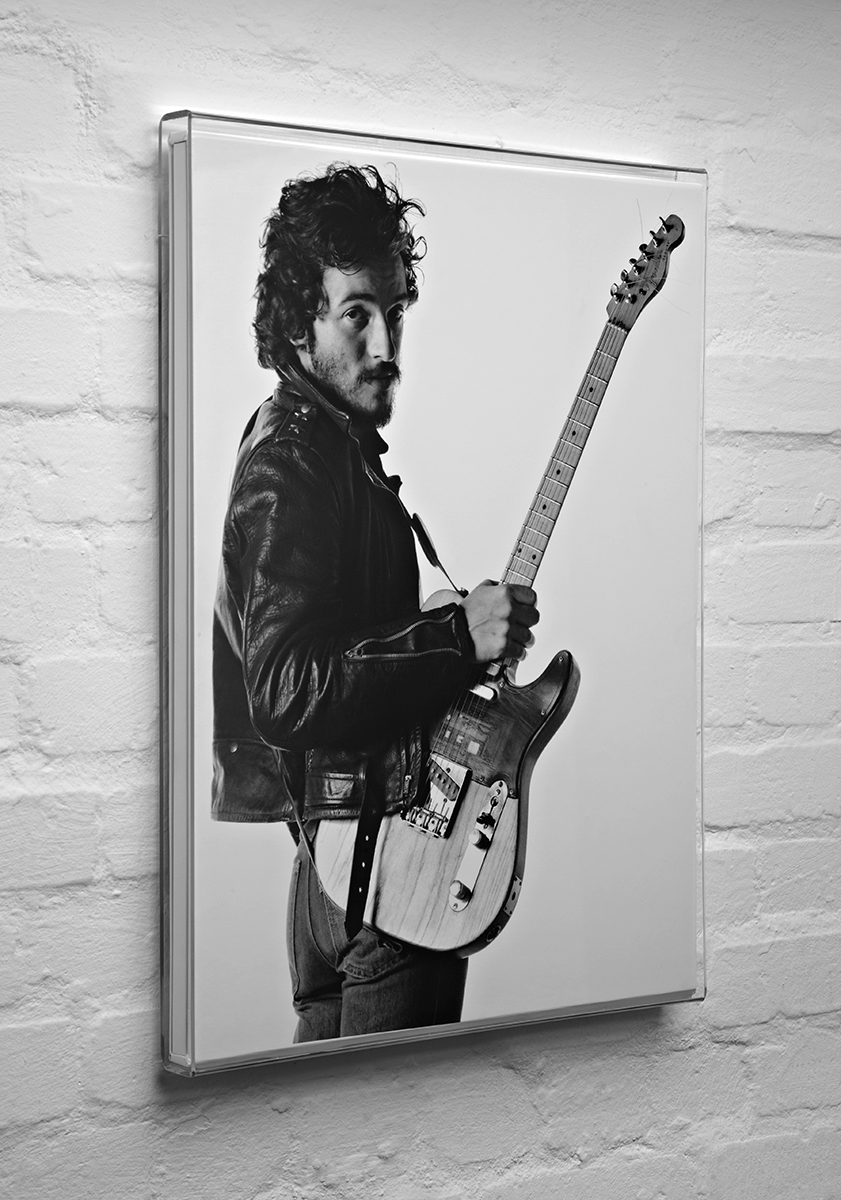
This is a book that defies the normal ‘coffee table’ convention. In fact, it is like no book you will have seen before: much larger than a traditional coffee table volume, it is slim and elegant at the same time. Born To Run Revisited is housed in a beautiful custom slipcase which reproduces the front and back book cover art. The slipcase is lined with black suedel, a felt-like material, which cushions and protects the book. The cover of the book and slipcase have been deliberately left free of text so that nothing detracts from the power of the images. As a result, the book looks like a work of art you could hang on your wall. And in fact you can, as we have developed a special slide-in-slide-out frameless acrylic frame that enables you to do just that.
More on that later.
Liking it so far? Then keep scrolling…
What’s inside?
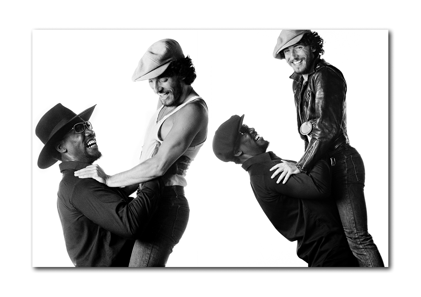
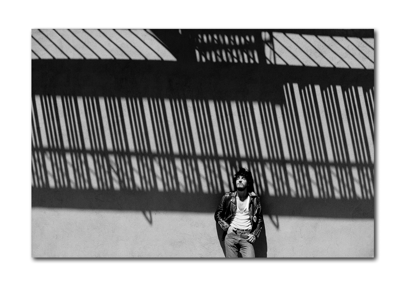
Born To Run Revisited contains Eric Meola’s most important images of Bruce Springsteen and Clarence Clemons from his June 1975 Born to Run photoshoot, alongside previously unpublished material.
Born To Run Revisited brings together familiar images in a spectacular new format, and at the same time introduces you to previously unpublished material. Eric has made his personal selection of the very best images from his 1975 Born To Run session to present in this dramatic 24 x 36 inch spread size. That spread size is no accident – it has been deliberately chosen in the same aspect ratio as 35mm film, namely 1:1.5. This is important as it allows the photographs to be presented across an entire double page spread, with no detail cropped out.
While a number of these photographs have been published in the past in books and magazines, they have never been presented in this physical scale before. Just imagine the classic Born To Run cover photograph, presented in its full uncropped glory, 24 inches high x 36 inches wide.
In addition, Eric has also ensured that a selection of previously unpublished photographs from the 1975 shoot are included in this incredible book.
Eric has also contributed a 2,000 word introductory essay as the introduction to the book.
Born to Run Revisited facts and figures
This ultra-large-format book measures a staggering 18 x 24 inches (45 x 60cm) when closed, and 36 x 24 inches (90 x 60cm) when open.
Born To Run Revisited has 96 large format pages, with 65 stunning black and white photographs, reproduced in sizes up to 24×36 inches (60x90cm), together with an introductory essay by Eric Meola, and is limited to 500 individually signed and numbered copies worldwide.
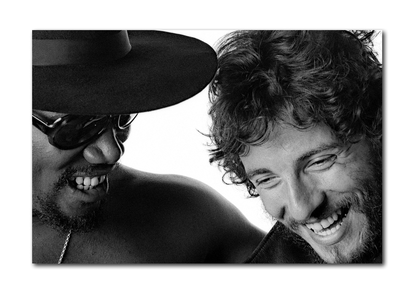
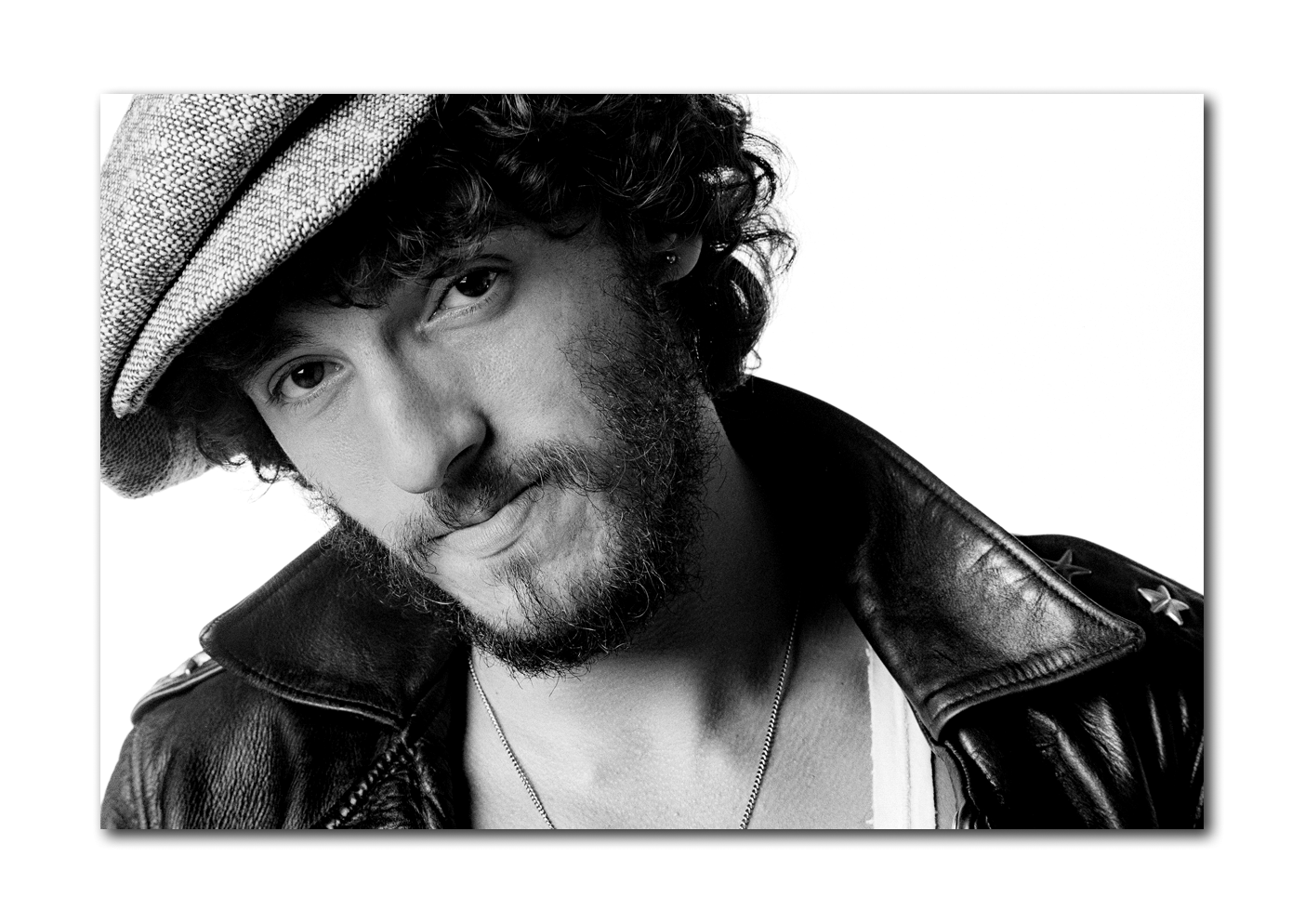
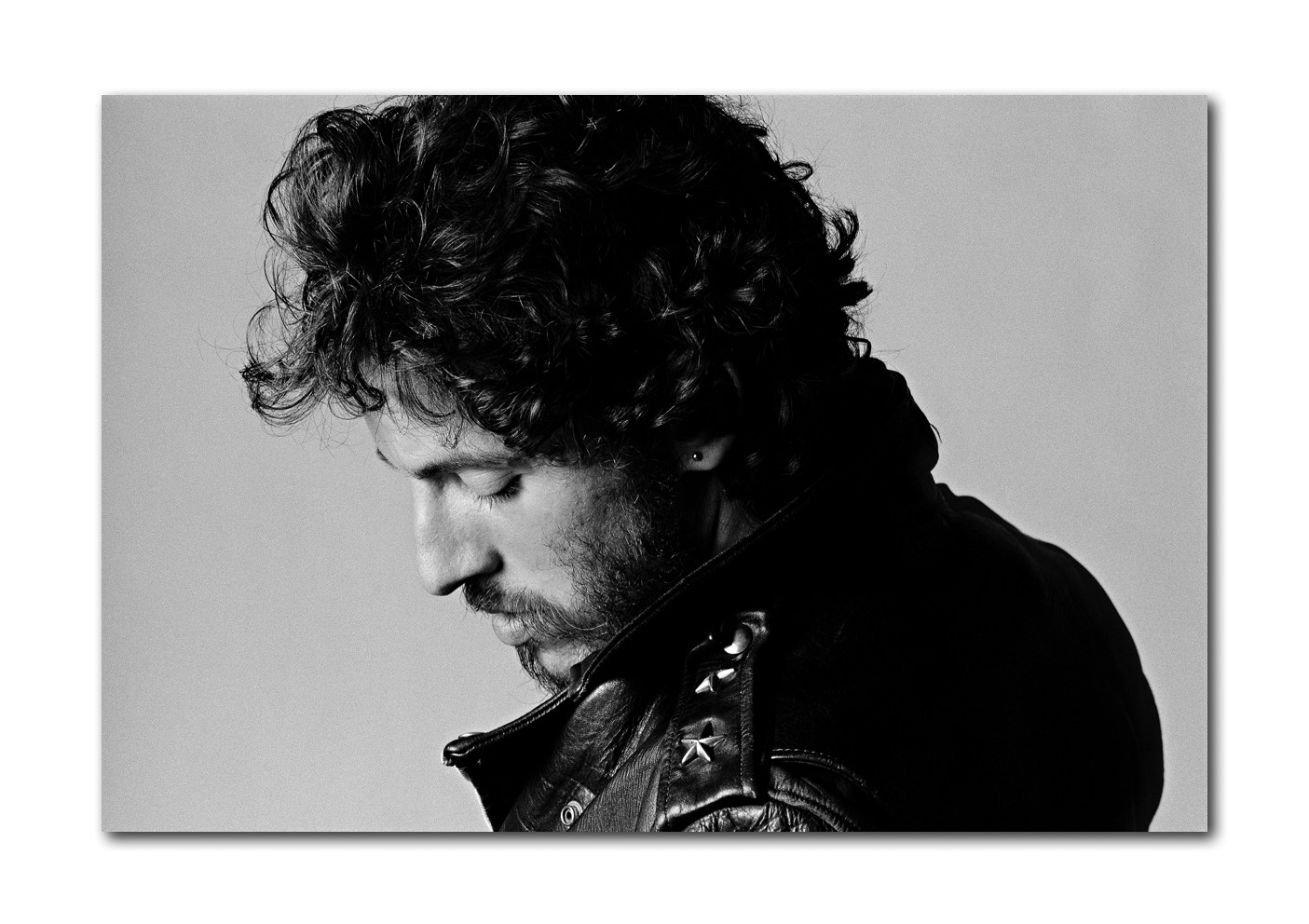
Born To Run Revisited is housed in a custom protective slipcase, with front and back cover artwork showing two portraits of Bruce Springsteen.
An optional acrylic slide-in slide-out wall unit allows you to display Born To Run Revisited on your wall.
Ormond Yard Press: Bringing you the bigger picture
Incredible levels of detail
The opportunity to present uncropped images across double page spreads reveals incredible levels of detail never previously presented in book format.
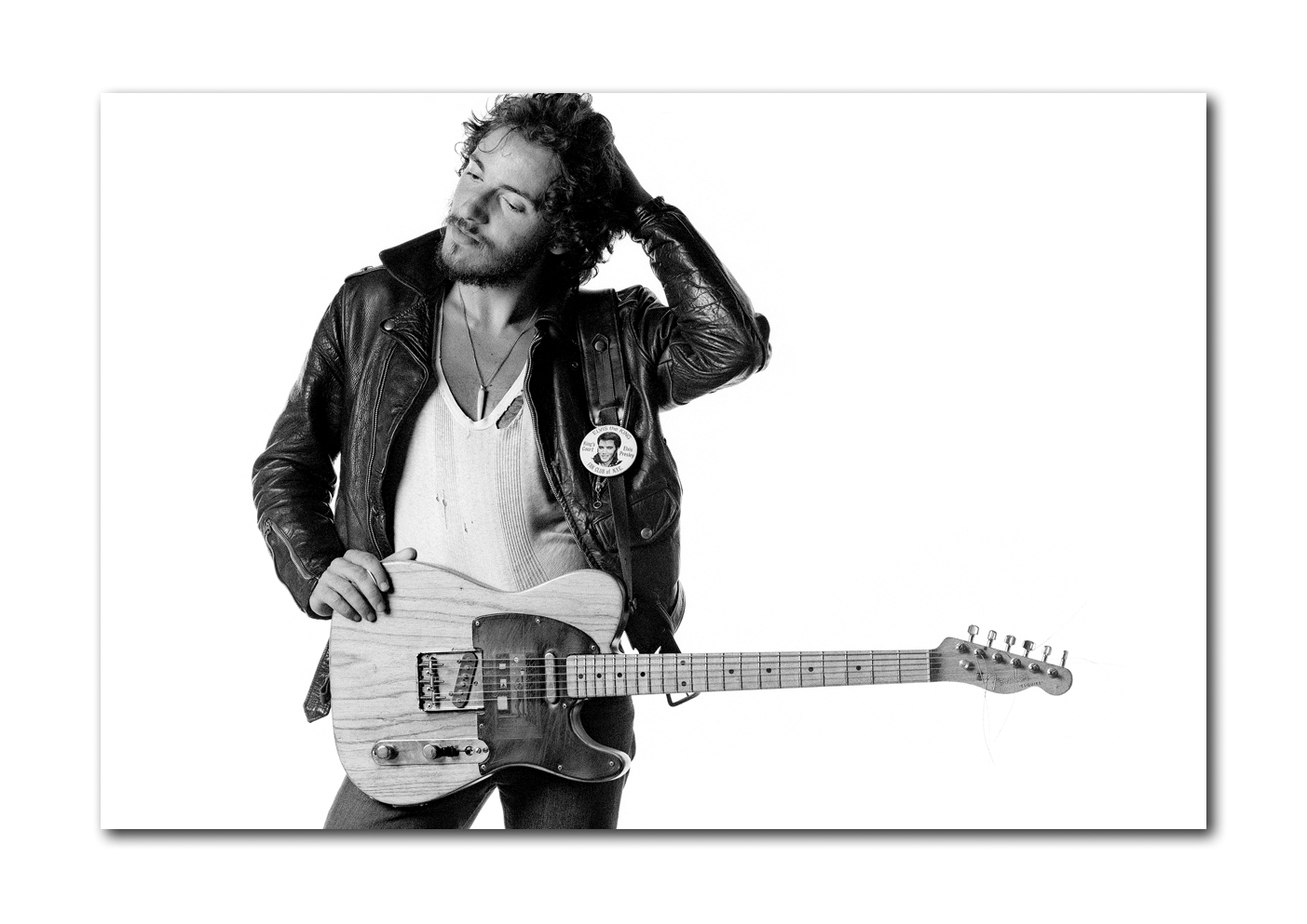
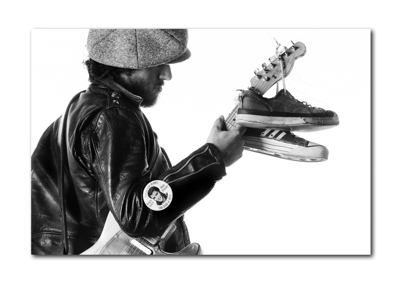
You will be amazed at the level of detail you can see in this book. Here’s an example: when you look closely at Eric’s Born To Run album cover photograph, presented uncropped as a glorious 24 x 36 inch (60cm x 90cm) double page spread, you will see there are not two, but five people in the frame. Bruce, Clarence, Elvis (on the badge) and two people on a tiny detailed painting on the leather pick guard on Bruce’s guitar. The painting on the pick guard is a revelation, and is something that most people don’t know about.
We’ve reproduced an extract here. Look closely at the pick guard and you will see a moonlit scene with a man leaning against a lamppost in front of a brick wall, while someone looks at him from a window of an adjacent building. The amazing thing about this is that here you have an image that you have looked at hundreds of times. It’s one of the most familiar photographs in the history of rock’n’roll. But if someone asked you how many people there were on the cover of Born To Run, you probably would have said two. That’s because you never had the chance to really look – until now.
Hang your book on your wall
Make no mistake, this is a big book, and we wanted to give you some different display options. Of course you can put it on your coffee table or (big) bookshelf, but we felt it deserved something a bit special. With each of our books, we took a conscious decision to keep the covers free of text, so that nothing would detract from the power of the chosen front and back cover images. That notion gave rise to the idea of this display unit – because it means you can, should you choose to, display your book just like a piece of art on the wall.
Constructed from 5mm clear acrylic, this is a solid, simple and practical way to display your book on your wall in its slipcase. It measures 18.5 inches (w) x 25 inches (h) x 1.5 inches (d). That’s approximately 47cm x 64cm x 4cm. It has curved edges, and a split baton hanging system on the reverse. Acrylic feet at the bottom ensures that it hangs parallel to the wall. It is a nice, elegant, simple, solid piece of work.
It is open sided on the left and right, allowing you to slide your book (and please read ‘book’ as ‘book and slipcase’ here) in and out whenever you want to look at the contents. You also have the flexibility to show the front or the back of the book and flip it over if you feel like a change of view.
Eric Meola recalls the session
Around 10 or 11am on June 20th, 1975, Bruce and Clarence walked into my studio on the fourth floor at 134 Fifth Avenue, carrying their instruments and a few changes of clothing. I had the Rolling Stones album December’s Children playing. The strobe lights were set up. It was just us – no stylist, no ‘hair and makeup’, no assistant. There was a six to seven inch difference in their height, and Clarence wore a tall black fedora during much of the shoot.
I kept several wooden boxes around the studio to adjust for height discrepancies, though for much of the shooting I did not use them. As Clarence riffed on several sequences of notes, I began shooting. We made quick changes of clothing and in the space of an hour and a half I shot almost 600 images. Then, we went outside, and I shot another few rolls underneath the fire escape. As we walked back to the studio, I glanced at my watch. It had been just two hours.
I processed the film immediately after the shoot, and the sequence in which the rolls were shot has been lost. However, the sequence within each roll still remains, and from that it is obvious that the interaction between Bruce and Clarence which resulted in the cover image lasted for about half a roll, or 18 frames. Of these, there are only two where his face is turned to Clarence, and he is grinning in only one of them. Clearly, it was an instinctual moment, and one which was brought on as much by practicality, as intent. Standing on a box, he was suddenly several inches taller; Clarence’s crouch hides this and makes the height difference disappear.
After I shot a number of images in which they stood back to back, and a few in which Bruce leaned on Clarence’s shoulder while looking out at the camera, he turned to the side and looked beatifically straight at Clarence for three or four seconds as I shot two frames. Other than his standing on the box, there was no ‘setup’ for this, no premeditation – and, his guitar was not plugged in. We were shooting fast, and if Bruce was after a particular image, he placed a lot of faith in me that in those few brief seconds I had captured the one that became famous. It happened as much because of the moment, as whatever chord progression Clarence was playing that caught Bruce’s attention.
Springsteen biographers and hagiographers as diverse as Dave Marsh and Louis P. Masur have made much of that moment and proclaimed that the cover signals an epic journey, even comparing it to Huck and Jim in The Adventures of Huckleberry Finn and Sidney Poitier and Tony Curtis in The Defiant Ones.
The mysteries of the Born to Run cover have assumed a mythical status that did not, of course, exist at the moment the album first appeared. The initial misspelling of Jon Landau’s name, the alternate cover with its sepia blacks and jagged type, the mystery of where Bruce obtained a membership-only Elvis button, and the herculean effort on Bruce’s part in the recording studio have long since magnified a sense that every last aspect of the album and its design were planned from the very beginning. Add to that the details that are revealed in this book of enlargements, such as the leather pick guard on Bruce’s guitar, which shows a man in silhouette standing against a lamp post at night while another person watches him from a window. My photograph of Bruce on the album jacket, leaning on Clarence Clemons’ shoulder, would forever become part of the vernacular of American pop culture. Over the years the pose was imitated by many other recording artists, including Sesame Street’s ‘Muppets’ and NPR’s ‘Car Talk’ hosts Tom and Ray Magliozzi.
When I delivered a large stack of prints and contacts to John Berg, I did not envision what he saw instantly – in Berg’s eyes, the most important part of the image was the space between their two faces, because it provided the perfect place to split the image. Folded open so that both the front and back show, Clarence becomes the center of a riveting line of body movement along with the line-of-sight of Bruce’s magnetic gaze. Yes, Clarence was right, when he said in his quasi-biography Big Man, that he is on the back; but for Berg he provided the link to the album’s front. Berg then extended the white space to the left to accommodate the long list of credits. In its original incarnation, as 288 square inches of area, it is as much a greeting card as an announcement, as much a billboard as an album cover.
Is it, as so many writers have stated, a declaration of the friendship and camaraderie between the two men? Yes. Was it a deliberate, premeditated statement by Bruce about race relations? Probably not. Yet it became that, and by including Clarence from the beginning, Bruce chose not only the one remaining band member he most identified with, but the one who happened to be black. In an album of saxophone solos, from ‘Thunder Road’ to ‘Jungleland,’ it seems an obvious choice. And, a brilliant one which came to symbolize far more than any of us could have envisioned.
Questions?
If you have any questions at all about Born To Run Revisited please just ask – we are here to help.

