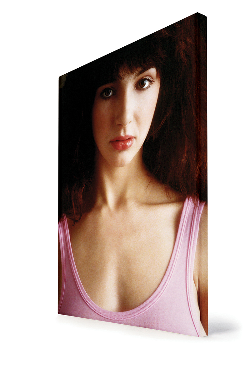
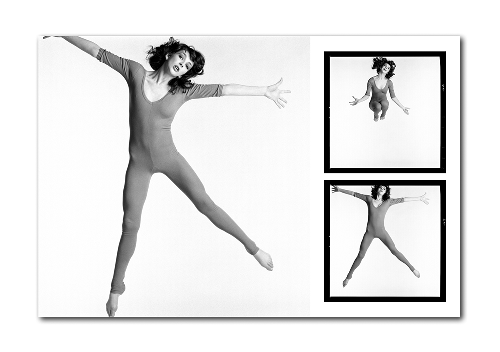
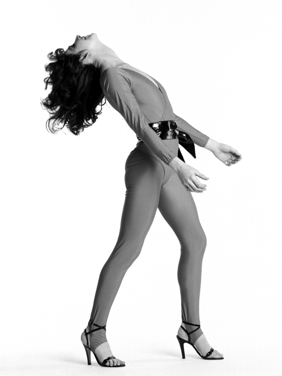
WOW! Kate Bush by Gered Mankowitz, the limited edition book from Ormond Yard Press.
Ormond Yard Press: Bringing You The Bigger Picture.
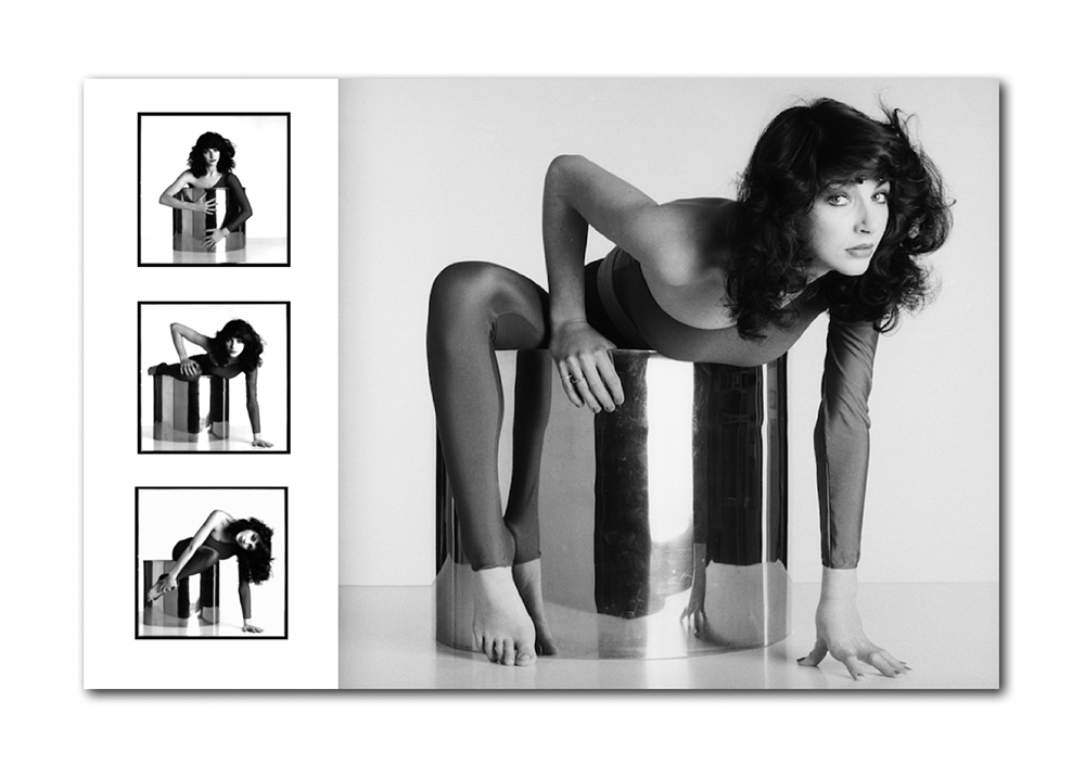
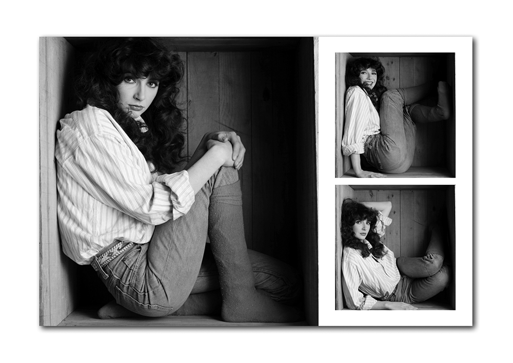
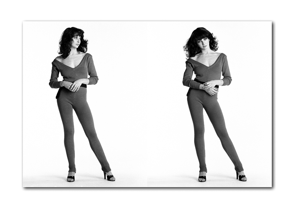
WOW! Kate Bush by Gered Mankowitz features the very best work from Gered Mankowitz’s incredible 1978 / 1979 archive of Kate Bush photographs, with the majority of photographs previously unpublished. Each copy is personally signed by Gered Mankowitz.
As with all previous Ormond Yard Press volumes, it is a book on a spectacular scale: a hardcover volume housed in its own printed slipcase and measuring 24 inches high x 18 inches wide (60x45cm) when closed, 24 x 36 inches (60 x 90cm) when open, with 96 pages of photographs. The physical scale may be large, but the edition size for WOW! is reassuringly small – just 750 individually signed and numbered copies are available to collectors worldwide.
Why should you buy this book ?
“Kate was a wonderful subject and I worked with her over several sessions throughout 1978 and into 79. She was always a delight and an inspiration to work with. I am immensely proud of the work I have done with her and will always be grateful to have been associated with such a gifted artist from the very beginning of her long and important career. I am tremendously excited to be launching WOW! and hope that it excites you too” Gered Mankowitz
WOW! is a book on a spectacular scale: an ultra-large-format 96 page limited edition hardcover which measures 24 inches high x 18 inches wide (60x45cm) when closed. When the book is open, a double page spread measures 24 inches high by 36 inches wide (60cm x 90cm). The physical size of WOW! may be large, but the edition size is reassuringly low. Just 750 are being offered for sale worldwide.
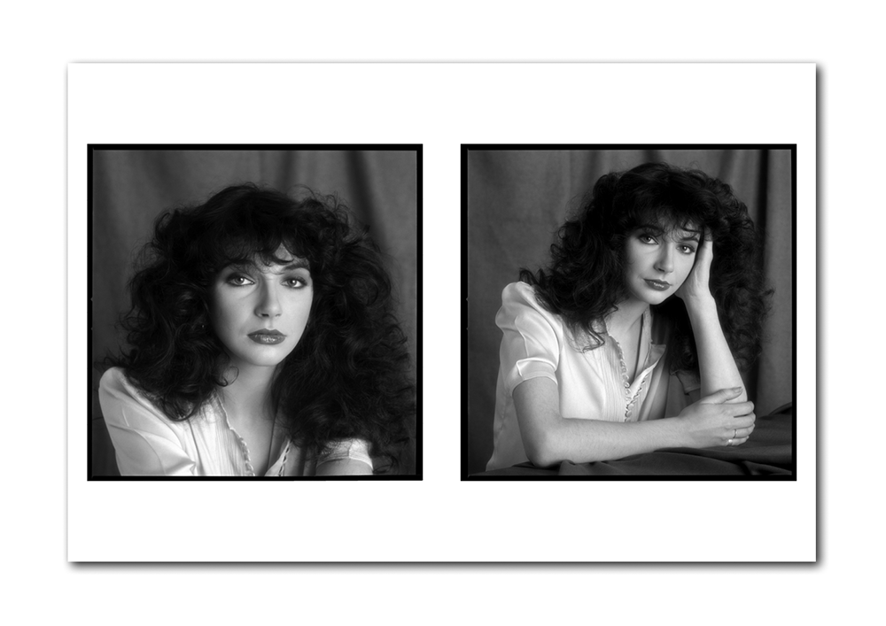
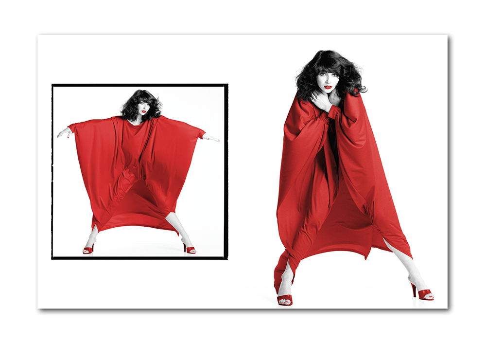
WOW! includes approximately 250 images, and contains the very best material from Gered Mankowitz’s archive of Kate Bush photographs. The vast majority of photographs are previously unpublished. The book is housed in a handsome printed slipcase, and each copy is personally signed by Gered.
WOW! defies the normal ‘coffee table’ convention. Much larger than a traditional coffee table volume, it is slim and elegant at the same time. WOW! is housed in a beautiful custom slipcase which reproduces the front and back book cover art. All our publications seek to redefine the book as more than just a book – and as a piece of art in its own right. With this in mind, the cover of the book and slipcase have been deliberately left free of text so that nothing detracts from the power of the images.
Why is this book important?
Why is this book important? Because something revelatory happens when a photograph is presented in a very large format like this. Hidden details come to light, and the power and impact of the image are magnified exponentially. Unless you go to a gallery and see a large format print on the wall, you can’t experience this. WOW! is like an entire art gallery exhibition that you get to take home and keep forever.
Our publishing arm, Ormond Yard Press, was established to bring to life a carefully curated series of spectacular large format limited edition photography books and has an express, and quite literal aim, of bringing you the bigger picture.
Each of our books focuses on a key moment or personality in the history of popular culture, and showcases the work of a photographer at the very top of his or her profession. We wanted to give these subjects the epic treatment they deserved, in a physical scale that was missing from traditional photo book publishing.
WOW! facts and figures
This ultra-large-format book measures a staggering 18 x 24 inches (45 x 60cm) when closed, and 36 x 24 inches (90 x 60cm) when open.
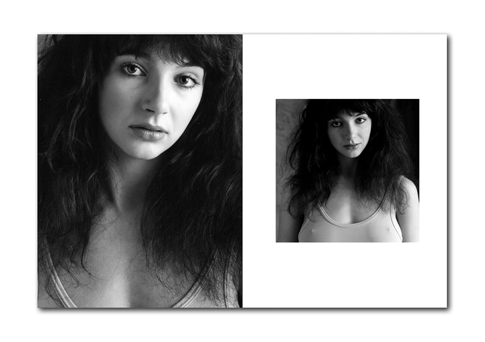
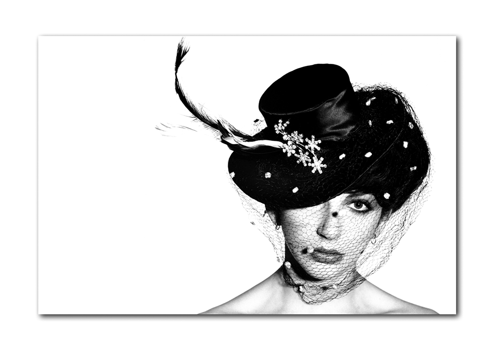
WOW! has 96 large format pages, with approximately 250 stunning black and white and colour photographs, reproduced in sizes up to 24×36 inches (60x90cm), together with an introductory essay by Gered Mankowitz, and is limited to 750 individually signed and numbered copies worldwide.
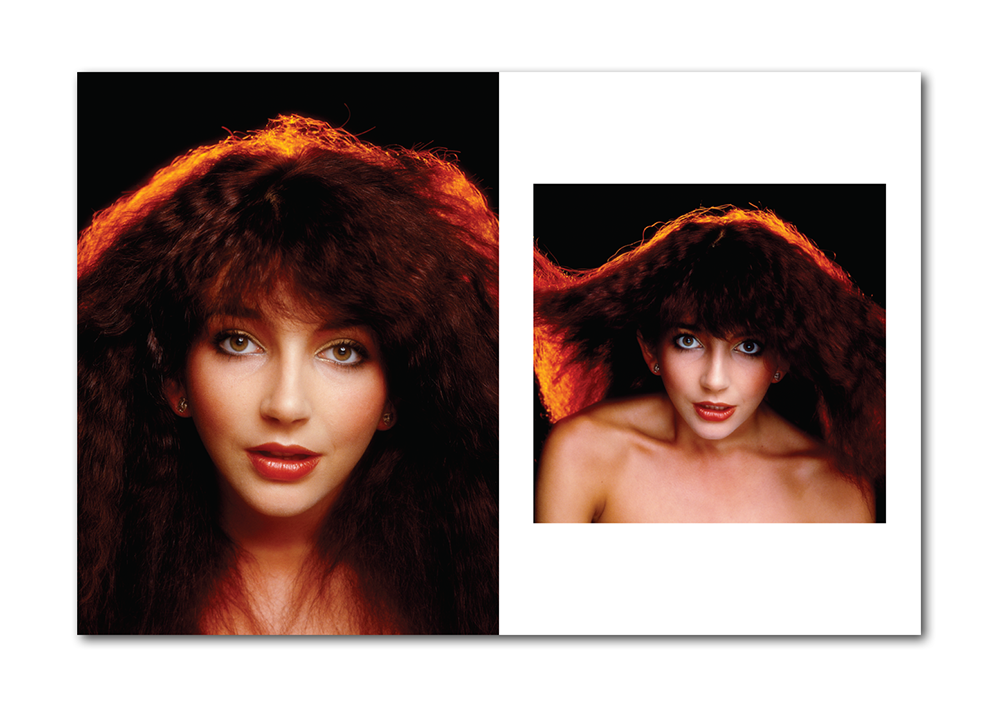
WOW! is housed in a custom protective slipcase, with front and back cover artwork showing two of Gered’s best loved photographs of Kate Bush.
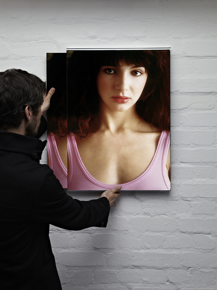
An optional acrylic slide-in slide-out wall unit allows you to display WOW! on your wall.
Ormond Yard Press: Bringing You The Bigger Picture
Producing WOW!
The project to produce WOW! came together over the summer and autumn of 2014. Worldwide interest in Kate Bush was at a significant high, fueled by a series of concerts after a gap of 35 years. Kate Bush fans gathered in London from all corners of the globe, and it seemed like most came to see us at our gallery just off Piccadilly. Wow. These were crazy times indeed.
For some time before then, Gered Mankowitz and I had been discussing a large format book of his photographs, and when he sent me a selection of rough scans of contact sheets from his sessions with Kate Bush, I was convinced that we were on to something very special. Over a period of a few weeks, the scans came through in batches, and by the end, I was able to see Gered’s entire surviving Kate Bush archive of images all together, in one place, at the same time. That’s not an opportunity you get every day. The more time I spent with these incredible images, the more I was sure that we needed to celebrate this archive in the ultra-large format offered by one of our beautiful books.
A detailed exercise to catalogue the original negatives and transparencies showed that we had a population of a little over five hundred images to choose from. Gered went back to his original records from 1978 and 1979 to date the sessions, and as part of the same exercise he was able to determine which photographs were taken at each of the four shoots.
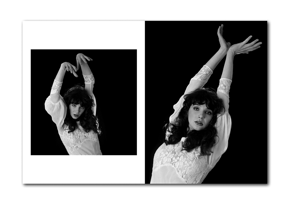
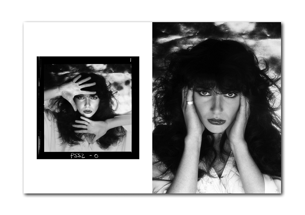
Deciding what to include and what not to include is always a challenge, but actually is one of the most enjoyable aspects of a project such as this, and Gered and I spent many hours together working through the selections. In the end, we have used around 250 images, just under half the surviving archive. For the most part the book presents the images in a stunning large format, and each image appearing in the book has been freshly scanned at the appropriate resolution and painstakingly cleaned to allow reproduction on this epic scale. On some double page spreads, we have presented images as contact sheets of twelve images – an entire roll of film – and in one incredible sequence of shots of Kate dancing from Gered’s fourth and final session, we present forty eight individual frames on one spread. The physical scale of the book means that each of these frames can still be seen clearly.
Gered photographed Kate Bush on four separate occasions between January 1978 and February 1979 and the four sessions are presented sequentially in the book. The first session produced the pink leotard photographs that were used to launch Kate. The second session was particularly prolific, while the sole focus of the the third session was the Lionheart album cover. In terms of physical output, the fourth and final session was actually even more prolific than the second, and given the importance of dance and movement, it is fitting that the images that end the sequence, and provide the last photographs in the book, are of Kate in motion, almost jumping out of the frame.
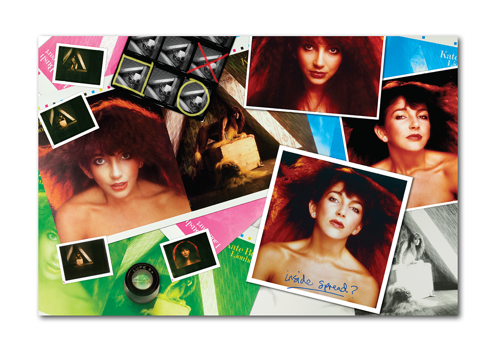
It was while trawling through his archives for the book that Gered uncovered a series of original Polaroids from the sessions that he had not seen for over thirty years. These Polaroids were used to test the set-ups and lighting, and we have included many of these polaroids in the book.
Guy White, publisher, Ormond Yard Press.
Hang your book on your wall
Make no mistake, this is a big book, and we wanted to give you some different display options. Of course you can put it on your coffee table or (big) bookshelf, but we felt it deserved something a bit special. With each of our books, we took a conscious decision to keep the covers free of text, so that nothing would detract from the power of the chosen front and back cover images. That notion gave rise to the idea of this display unit – because it means you can, should you choose to, display your book just like a piece of art on the wall.
Constructed from 5mm clear acrylic, this is a solid, simple and practical way to display your book on your wall in its slipcase. It measures 18.5 inches (w) x 25 inches (h) x 1.5 inches (d). That’s approximately 47cm x 64cm x 4cm. It has curved edges, and a split baton hanging system on the reverse. Acrylic feet at the bottom ensures that it hangs parallel to the wall. It is a nice, elegant, simple, solid piece of work.
It is open sided on the left and right, allowing you to slide your book (and please read ‘book’ as ‘book and slipcase’ here) in and out whenever you want to look at the contents. You also have the flexibility to show the front or the back of the book and flip it over if you feel like a change of view.
Gered Mankowitz recalls the Lionheart session
The back cover of the book (and slipcase) features a colour photograph of Kate from the Lionheart session. Here Gered Mankowitz shares his recollections of that shoot.
The session for the Lionheart album cover took place in August 1978. I had previously met with Kate and we discussed the concept, which was to feature Kate dressed up in a lion suit and was to be set in an old dusty attic.
We constructed the attic room set in my Great Windmill Street studio. I found the Lion headpiece in a fancy dress shop near Olympia, but the costume was made to measure, and fitted Kate perfectly. I did not want the attic to be filled with the usual sort of junk you find in old attics, because I felt that it needed to be quite sparse in order to keep as much focus on Kate as possible. The box we used on our earlier Kick Inside session came into play again, as well as a couple of little props and a great deal of spray-on theatrical cobweb. I had designed the set so as to have a large window through which to light the shot, and apart from a few reflectors, that was it.
We had agreed that I would art direct the cover, and my then assistant Richard Gray would design it and produce the artwork. Richard had come to me from a design background and was extremely talented, and we worked together as a team on several other covers around this time. We had all agreed that the sleeve would be presented as a gatefold with both sides designed, as much as possible, as “front” covers. The inside spread would carry the lyrics and would include the title track hand-written by Kate.
For the reverse “front” cover, I shot a series of very dynamic portraits with a dark background and a powerful orangey red back-light which I have always referred to as the ‘redhead’ series. I love the portrait that we selected for the back cover, although there were several others that were just as strong. The angle of the selected shot does seem to complement the attic image perfectly, and the pair work beautifully together. Other portraits from this series were subsequently used for various purposes, including the cover for the single ‘Hammer Horror’.
Questions?
If you have any questions at all about WOW! please just ask – we are here to help.

