The Vermeer Treasury
What a treat it is for me to present the Vermeer Treasury—an exquisite collector’s cabinet containing the complete works of Johannes Vermeer. This is our unique take on how an important body of public domain art can be presented in its entirety.
If you look up the word ‘Treasury’ in a dictionary, you will see it variously defined as “a place where treasure is stored” or “a collection of valuable or delightful things.” I could not put it better. Think of this as your own personal Vermeer museum. It allows you to experience the complete body of remarkable work by the Dutch master in an innovative and focused way. You can immerse yourself in a world where everything is there in one place, to delight you whenever you want to reveal the magic inside. The collection is housed inside a beautiful custom-made cabinet on a stand—a precious object which itself references the art within—and which you can admire and enjoy every day.
The Vermeer Treasury is a perfect example of the kind of bespoke cabinet that we are now offering to collectors, celebrating the complete work of an important artist. It is deeply satisfying to bring something as extraordinary as this to life—and I can’t wait to tell you all about it, and how it came to be.
Guy White, Director, Snap Galleries
A selection of images of The Vermeer Treasury
Why does it exist and who is it for?
To tell you that let’s go back to April 2023.
There I am, standing in a building in central Amsterdam.
I am surrounded by people, but I don’t really notice them—because I am focused on something else.
The building is the Rijksmuseum, and I am here for Johannes Vermeer.
That 2023 Vermeer exhibition at the Rijskmuseum was a superlative, once-in-a-lifetime experience for me, and for more than 650,000 Vermeer fans from all around the world who made the journey. More original Vermeer paintings had been gathered in one place than at any time in their history. When I left the building, I felt a sense of regret—of somehow missing this collection of extraordinary work. Driving home, something was nagging at me. I asked myself a question: was there a way to bottle and preserve the essence of what I had just experienced? The drive back to my home in England gave me plenty of time to refine my thinking and to start to sketch out an answer.
Something is missing
As I thought about it some more, here’s the realisation that struck me.
Let’s say that you are passionate about the work of Botticelli, or Caravaggio, or Vermeer—or any one of an extraordinary list of master painters from the renaissance onwards, whose work is now in the public domain. Let’s also assume you have fairly deep pockets. Even so, owning an original painting by any one of these artists is simply not on the cards. They are rarely up for sale, and when they are, you will find yourself up against a bunch of billionaires in a feeding frenzy. Look at the Salvator Mundi if you want an example of what can happen.
Nevertheless, you love beautiful objects (there’s no shame in that) and you want to celebrate the work of your favourite artist in a very special physical format.
The question is, what is out there for you?
I’ll tell you—because I have looked high and low.
There’s nothing.
That night a girl with a pearl earring visited me in a dream*.
She whispered into my ear:
“Go to the future.
See how collectors are enjoying their art.
Then come back, and build what you saw.
And make sure you tell people about it.”
“OK” I said….
*She didn’t really.
An itch to scratch
Knowing there was nothing out there, was it even a problem?
To me, it felt like a big itch that needed a serious scratch—and that was good enough. So we got to work.
We set ourselves a challenge: to come up with a new way to experience a complete collection of art by a single artist. We wanted to do something different, with some alternate thinking, starting with the premise that art has to go on a wall to be enjoyed. Why not present a collection of paintings inside a beautiful cabinet that itself references the artwork contained inside, with contents and container working together in harmony.
It is nourishing for the soul to see—or own—beautiful things, and for beautiful things to exist, someone has to make them. On this occasion that someone is us. If you like what you see, read on, and find out how we can make a bespoke cabinet just for you.
Design considerations
How do you start to come up with a design for something like this? At the outset we knew that it needed to be a completely bespoke presentation that would display our deep reverence for Vermeer’s work, with all elements pulling together to delight its owner.
Each stage of the design process involved a series of small but important decisions, all leading to the final design. Every single detail is important and because of this we have obsessed over each element of the cabinet and its contents, both inside and out. In a nod to many of Vermeer’s paintings, we wanted the outside to exude quiet calm, while inside, opulence was key.
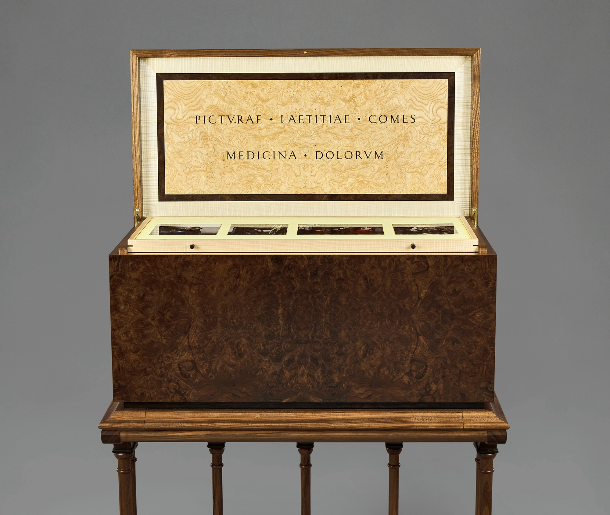
The first consideration was that it had to be a stunning handmade piece of furniture in its own right, made by a master craftsman. From the outside it would not be obvious what lay within—but the outside of the cabinet would need to be so enticing and intriguing that a curious viewer would be left with no choice other than to approach it and admire the extraordinary external finish. With no real visible joins, the immediate question would be: “How do I get inside this, and what will I find when I’m there ?”
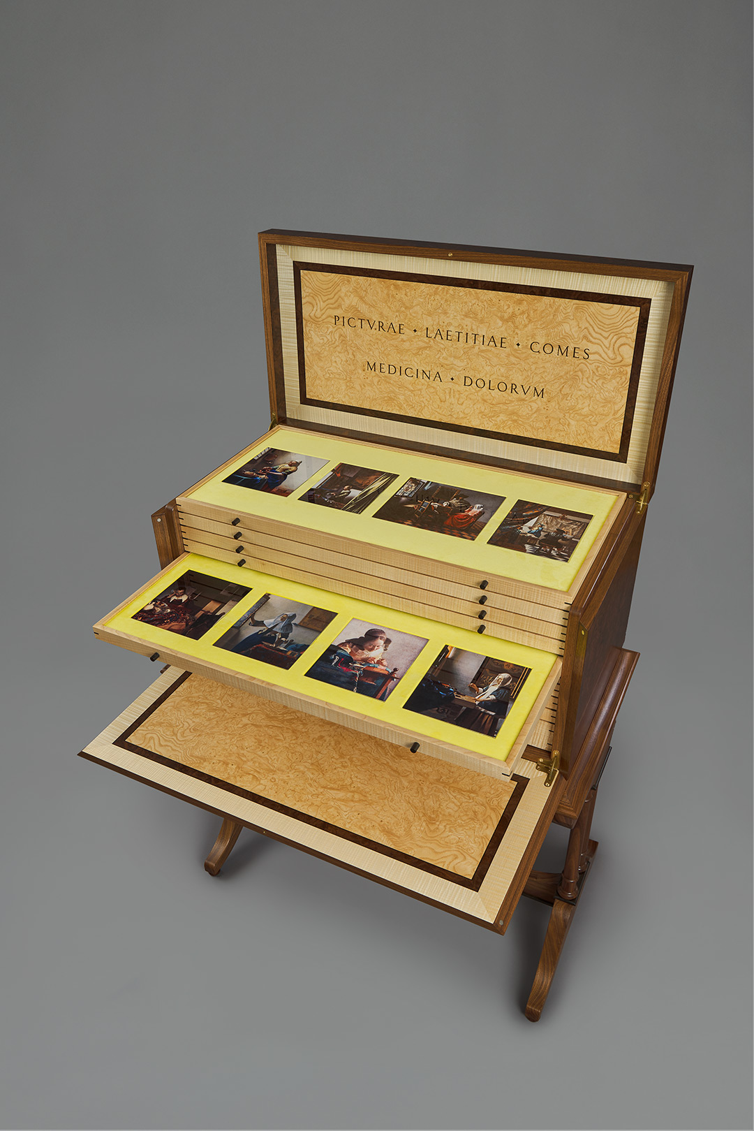
The magic would then begin when the lid was lifted, revealing two “wow” factors. First, the inside lid itself, with its latin inscription and ornate burr bandings. Then, with the lid raised, the first view of the artworks inside. The top tray is immediately visible, and four precious artworks are revealed—their highly polished finish contrasting with the soft yellow velvet backdrop, where they sit in custom recesses.
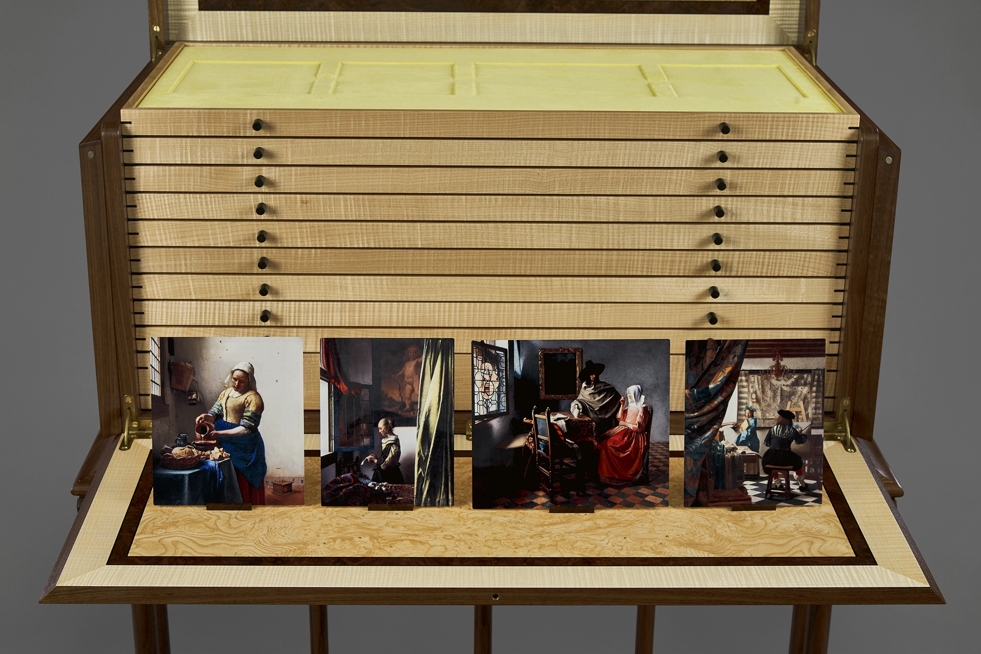
With the lid open, the viewer can lower the front of the cabinet to reveal the inner trays, accessing the individual artworks in velvet lined drawers. The individual artworks can be displayed on bespoke wooden stands which are included in the bottom drawer, alongside a beautiful full leather bound book.
Access—opening and closing the cabinet
We wanted to reference something in one of Vermeer’s paintings in the design of the cabinet. We found the answer in a painting in the Royal Collection in the UK—The Music Lesson. The painting shows a young woman standing at a virginal, receiving a lesson from an elegantly dressed music teacher standing to her right. The virginal influenced the mechanics of the lid and front of the cabinet. On our cabinet the lid is hinged at the back and opens up to just beyond 90 degrees. It is important to be just beyond 90 degrees so that it won’t accidentally fall closed.
In The Music Lesson, the inside lid of the virginal is in the raised position, and displays a latin inscription, partially obscured by the lady standing. Translated into English, the meaning of the inscription can be approximated as: “Music is the companion of joy, balm of the sorrows”. We liked the idea of including a similar inscription in the Vermeer Treasury, so we have included our own latin inscription on the inside, amending the Latin on the original painting to make the words more relevant to the contents of the cabinet. It reads “Picturae laetitiae comes medicina dolorum”. This can be approximately translated as “Paintings are the companion of joy, balm of the sorrows”.

An extract from The Music Lesson
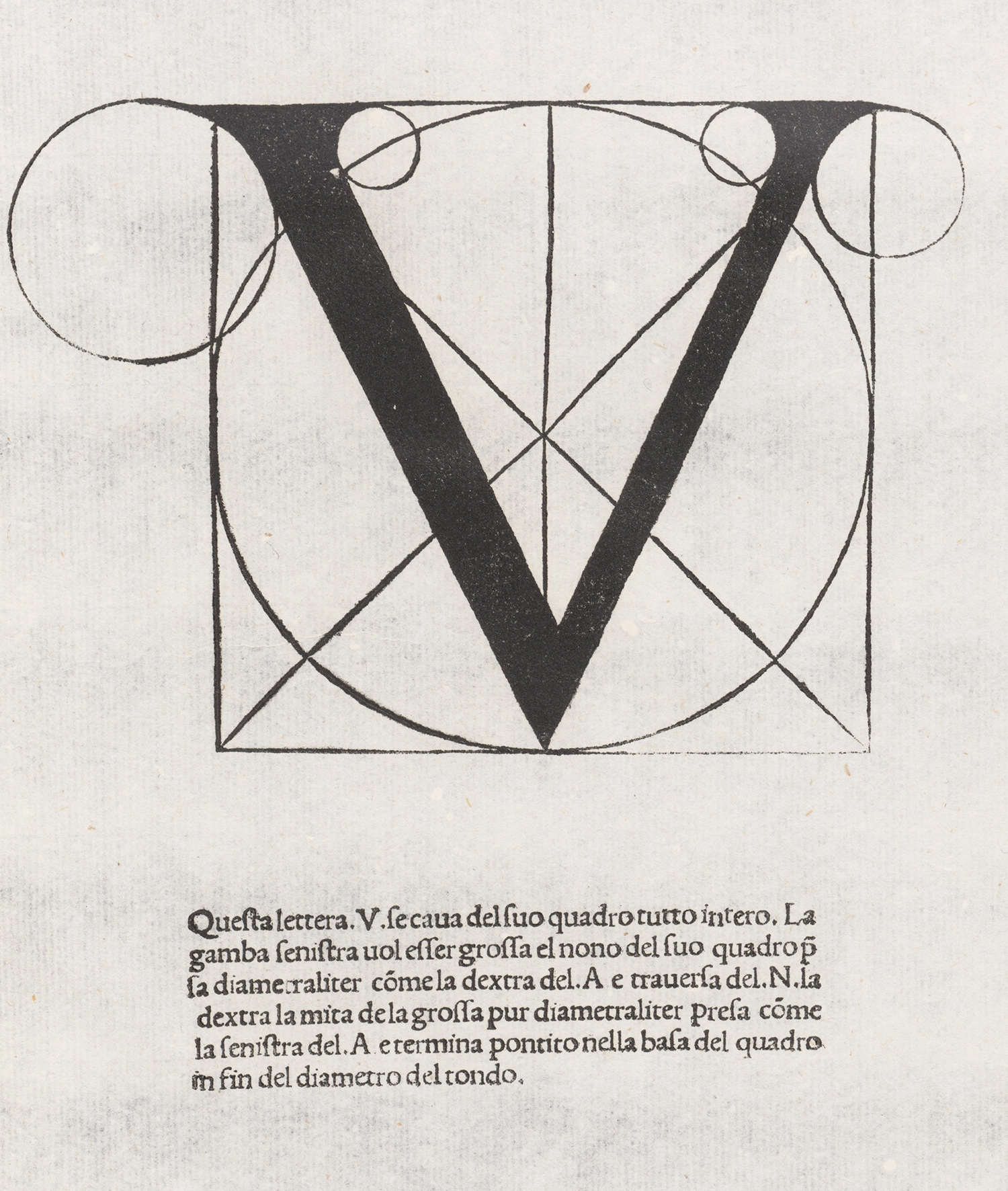
On the inside lid we present this capitalised and split over two lines, with the Us becoming Vs. That presentation is faithful to the classical roman alphabet, which contained 23 letters—and no U. In any case, V is for Vermeer, right? Incidentally—eagle eyed Vermeer aficionados may have noticed that we have changed Letitiae (which appears in the painting) to Laetitiae: a deliberate choice as if we are using the classical roman alphabet for the inscription, we prefer the classical spelling to the early modern version of the word.
Back in the mid seventeenth century, latin inscriptions like this were common on the inside lids of virginals such as that featured in The Music Lesson. These would have been printed on paper and the whole sheet glued to the inside lid. For our cabinet we have taken a more elegant approach. Individual letters have been precision cut from burr black walnut and inlaid into the central panel of burr ash.
Our inspiration from the virginal in the Music Lesson does not end there. We wanted the front face of the cabinet to open in the same way that the virginal in the painting opens up—towards the viewer, hinged at the front. The front is hinged to 90 degrees rather than the 180 degree hinge common in virginals because the front is used as a display stand and the 90 degree stop is important. A support flap with touch-latches (discreetly hidden in the stand) gives some extra support to the cabinet front when it is opened. The reason for resting the front section at 90 degrees is that it allows the display of selected artworks when the cabinet is open, using special miniature stands included in the bottom drawer of the cabinet for this purpose.
Fonts
We spent some time considering the most appropriate font for the text. Careful study of the individual letters in the surviving examples of Johannes Vermeer’s signatures which appear on many of his paintings show a striking similarity to a font included in Divina Proportione, a book published in 1509 in Venice by the Italian mathematician and father of double-entry bookkeeping, Luca Pacioli. Take a look at Pacioli’s M with its four limbs—it is included with the images alongside. The first and third limbs are thinner than the second and fourth limbs. This is how Vermeer signs his M on many of his paintings—for example on his signature on The Geographer. You can see it on the V as well, where Vermeer uses a V with a thinner right limb compared to the left limb.
A close examination of The Music Lesson gives us a better view of the letters on the inside lid in the painting. The M and the V do seem to follow this same principle—with thicker and thinner limbs. So we had our font.
The contents
The first consideration in approaching the question of how to house the complete works of Johannes Vermeer, is to determine which paintings are acknowledged by scholars to be by Vermeer. Are there 37? Maybe 35? Possibly 34? There is controversy over some attributions. In particular there are question marks over the attribution of three paintings—Saint Praxedis (National Museum of Western Art, Tokyo), Girl with a Flute (National Gallery of Art, Washington DC) and the Young Woman Seated at a Virginal (The Leiden Collection, New York).
Our approach is actually quite simple on the question of attribution. You remember that the 2023 Vermeer exhibition in Amsterdam was the inspiration for this project? Well, the book that was published to coincide with the Amsterdam exhibition (a special version of which is included in the cabinet), includes 37 artworks attributed to the master, and we have included these 37 in the cabinet.
We also had to make a decision as to the size of the individual artworks in the cabinet. There were various approaches to consider. For example, one option would be to make them in proportion to the sizes of the original paintings. Given the extreme size variation in Vermeer’s originals—his largest painting is over 60x the size of the smallest—we found that producing small versions to individual scale would have lead to such a wide diversity of sizes of pieces in the cabinet that it would not have been practical.
Once we had made some decisions on the maximum overall size we want the cabinet to be, and once we had come to the view that we wanted one row of artworks in each drawer, then mathematics gave us the answer. By setting a common height for each artwork, we could present a row of four artworks in a drawer in a clean and elegant presentation. It gave a sense of calm and made it easy on the eye when viewed from left to right (or right to left for that matter).
We tested a number of sizes, and determined that a common height of 17.5cm (just under 7 inches) for each artwork resulted in a cabinet with the overall size we wanted, and ensured that the contents of each drawer had room to breathe. With a height set at a fixed size, then the widths of each artwork do of course vary, in proportion to the size of the original paintings. Each artwork is set within its own recess in a velvet lined drawer, and because no two sizes are exactly the same, each recess had to be cut to the exact bespoke size of the artwork in question. That was something that the cabinet maker could achieve for us, so we had our solution.
Keen mathematicians will realise that 37 is a prime number and does not lend itself to an even split of artworks over a fixed number of drawers in the cabinet. We wanted to keep the number of artworks in each drawer fixed at four, and that meant nine drawers would only account for 36 artworks. The final artwork—the Young Woman Seated at a Virginal from the Leiden Collection—sits in the tenth drawer, along with some other objects pertinent to the collection.
How are the individual artworks made?
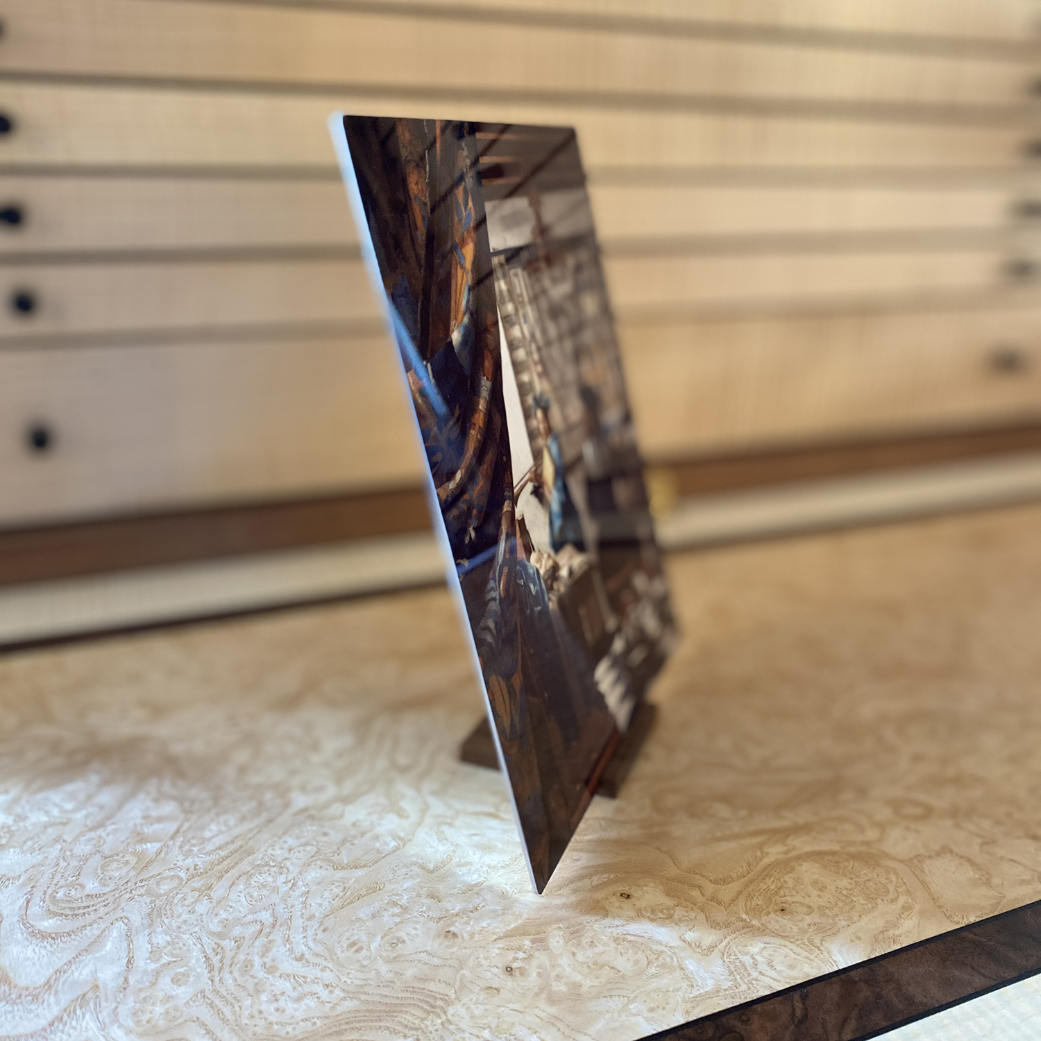
Each painting is reproduced as a ChromaLuxe print. Chromaluxe printing is an archivally stable process that produces images with outstanding detail and depth. The technique uses a process called dye sublimation to fuse the image directly into the surface of a 1.2 mm thick panel of white-coated aluminium.
The resulting prints have an ultra-high-gloss finish, richly saturated colours and details, and a jewel-like appearance. They are very resilient and require no additional glass, acrylic, lamination or coating to protect them. The dye sublimation process renders images waterproof, abrasion resistant, fire resistant and chemical resistant.
Because of the small size, each artwork becomes a precious object, which can be easily handled and viewed. The benefit of the ChromaLuxe process is that the resulting artwork has its own structural rigidity and integrity, and, unlike a standard print on paper, a ChromaLuxe print can be picked up and handled without any risk of damaging the surface. The resulting prints have a spectacular clarity and purity—with a vibrancy and immediacy that you don’t get with a traditional print on paper. When you hold one of these small precious objects in your hands it is as if you have a direct relationship with the image.
How we chose what to combine in each drawer
This was more time-consuming than we could have imagined at the outset, but very rewarding. We went through a number of iterations in the process of deciding what to put in each drawer. Early on we decided that arranging artworks chronologically would not work well, not just because of the uncertainty over the actual chronology, but because grouping into subjects/themes just worked better in this context. This then provided the overarching strategy, but inevitably some tweaking was involved, as the paintings within a particular theme do not always fall into convenient sets of four.
Here’s how we split the contents over the ten drawers—with a slideshow below to give you a visual on each.
Drawer 1 Theme: Masterworks (a personal view)
Left to right: The Milkmaid, Girl Reading a Letter at an Open Window, The Glass of Wine, The Art of Painting.
Drawer 2 Theme: Tronies
Left to right: Girl with a Red Hat, Girl with a Flute, Girl with a Veil, Girl with a Pearl Earring.
Drawer 3 Theme: Letters
Left to right: Woman in Blue Reading a Letter, The Love Letter, Mistress and Maid, Woman Writing a Letter with her Maid.
Drawer 4 Theme: Music
Left to right: The Concert, The Music Lesson, Young Woman Standing at a Virginal, Young Woman Seated at a Virginal.
Drawer 5 Theme: Solitary moments
Left to right: A Maid Asleep, Young Woman with a Water Pitcher, The Lacemaker, Woman Holding a Balance.
Drawer 6 Theme: Silk and fur
Left to right: Young Woman with a Lute, Woman with a Pearl Necklace, The Guitar Player, A Lady Writing.
Drawer 7 Theme: Men (sometimes behaving badly)
Left to right: The Procuress, Girl Interrupted at her Music, Officer and Laughing Girl, Girl with a Wine Glass
Drawer 8 Theme: Landscape and learning
Left to right: The Geographer, View of Delft, The Astronomer, The Little Street
Drawer 9 Theme: Myths and Religion
Left to right: Saint Praxedis, Diana and her Nymphs, Christ in the House of Martha and Mary, Allegory of the Catholic Faith
Drawer 10
Left to right: Leather bound book, magnifying glass, four stands, Young Woman Seated at a Virginal (Leiden version)
Overall shape and size
The Music Lesson also had an influence on the shape of the cabinet—not in the exact proportions—but a horizontal rectangular shape was what we needed. That was important as it allowed us to present the artworks in each drawer in a single row.
What about the overall size ? The cabinet needed to be an appropriate size for a residential setting, with the heights of each drawer allowing for easy viewing of the contents.
With the lid closed, the overall size of the cabinet and stand is 114 x 92 x 52 cm (height x width x depth). In imperial measurements, that converts to approximately 45 x 36 x 20 inches. With the lid open, the height increases to 152 cm (approximately 60 inches).
Sometimes, things just have to be.
That’s the case with the Vermeer Treasury.
It isn’t born out of focus groups.
It is not the result of market research.
We just wanted it to exist, so we made it.
The materials
The front, back, sides and top of the cabinet are veneered in a beautiful burr black walnut. This burr walnut is a thing of staggering beauty—the ‘smoky’ patterns are kaleidoscopic. Each time you look at any part of the burr close-up you will see different shapes, patterns and even ‘faces’ peering back. It is quite hypnotic. The sheets of veneer used on the visible areas of the cabinet have been carefully ‘book-matched’, creating a mirror effect by reversing alternate leaves of veneer and bringing opposite edges together. This creates a symmetrical grain pattern and a unique character to the finished piece.
Once the lid is raised to its open position, the individual elements of the inside lid reveal themselves. A lipping of American black walnut frames the lid. On the inside surface of the lid, a wide banding of rippled sycamore leads to a narrow banding of burr black walnut, itself contained within dyed tulipwood stringlines. The central panel bearing the latin inscription is burr ash, while the letters of the inscription are individually cut from burr black walnut and inlaid into the burr ash central panel. Brusso brass quadrant hinges connect the lid to the cabinet, with extra stability provided by a central Brusso brass butt hinge. A brass location pin on the inside centre of the lipping provides additional security holding the lid in place.
The act of lifting the hinged lid away from the viewer immediately reveals four artworks in the top drawer, and opening the hinged cabinet front towards to the viewer reveals all ten drawers. Each drawer is lined with yellow velvet, with individual recesses cut to house the artworks contained within.
With the lid raised just one drawer is visible—a fixed top drawer containing four artworks: The Milkmaid, Girl Reading a Letter at an Open Window, The Glass of Wine and The Art of Painting. What? No Girl with a Pearl Earring? Indeed no. She is sitting patiently in the second drawer.
To access the other nine drawers, just give a gentle pull on the cabinet front. This releases it from the fields of two rare earth magnets set inside the top of the carcass. The cabinet front drops forward 90 degrees, supported by two Brusso brass quadrant hinges to the left and right, and a central Brusso brass butt hinge, just like in the lid. A pull out support flap set within the base provides further stability.
The inlay on the inside of the cabinet front follows the same layout as the cabinet lid: a wide banding of rippled sycamore, a narrow banding of burr black walnut contained within dyed tulipwood stringlines and a central panel of burr ash.
The drawers are constructed from rippled sycamore, with individual drawer handles (set left and right) made from bog oak. Each drawer has a small inset corner fixing, known as a key, which is also made from bog oak. There is a small shadow gap between each drawer. The drawers are lined with yellow velvet, with bespoke recesses cut to the individual size of the artworks contained in each drawer. The top drawer is fixed, and drawers two to ten can be pulled out to a pre-set limit, sufficient to reveal the artworks within, and to allow the artworks to be removed easily.
The internal carcass is made from American black walnut. American black walnut is also our chosen wood for the stand, which has seven turned legs. The capping on the legs are made from bog oak and the stand sits on adjustable feet.
From all sides, and whether open or closed, we have made sure that the cabinet is a thing of beauty to behold.
The Stand
The actual stand on the virginal in The Music Lesson is a fairly plain affair, and we wanted something a little more ornate to support the cabinet. A deep dive into the world of these seventeenth century instruments gave us a number of design ideas, which we have synthesised in the final design of the stand.
The stand for the Vermeer Treasury is made from American black walnut, and has seven turned legs (two at each end, and three spread evenly across the centre). A discreet touch-latch in the base extends a hidden shelf which provides stability and support to the cabinet front when lowered. The cappings on the turned legs are made from bog oak and the stand sits on adjustable feet. The cabinet is connected to the stand using four removable bolts.
In the photographs and diagrams below you can see the pullout support shelf hidden within the stand, and the detail of the turned legs and feet.
Other contents
OK—that’s a lot to digest on the cabinet and the Chromaluxe artworks, but there are some other contents we want to mention.
The book
Vermeer is the book published in 2023 to accompany the Vermeer exhibition at the Rijksmuseum in Amsterdam which was held 10 February to 4 June 2023. A 320 page hardcover bringing together diverse strands of the Dutch master’s professional and private worlds, this major authoritative study of Vermeer’s life and work considers all thirty-seven paintings and contains a wide selection of contextual illustrations, commentaries and up-to-date research by distinguished international Vermeer scholars.
As the Vermeer Treasury was itself inspired by a visit to the 2023 exhibition, we wanted to include a special edition of this book in the collection. Our version is fully bound in beautiful blue goatskin, with a single gold string line on the front and back covers, five raised bands on the spine, with gold tooling and lettering (VERMEER capitalised in gold on a black background and the dates 1632-75 in gold at the base of the spine). In its binding, the book measures approximately 27 x 23 x 4.25 cm.
Vermeer’s signature varied from painting to painting, but his use of a capital I sitting inside an M appears on fifteen of his paintings. I think he would have been quietly pleased with this ‘logo’ once he hit on it. The V formed within the M gave him an I, V and M—all three of the important letters in his name—with the economy of only having to write two. It’s an impressive piece of graphic design and branding. We have repeated the IM logo on the inside front and inside back covers—you can see how this looks in some of the images in the slideshow.
To round things off, we selected matching vintage marbled endpapers for the inside front and back.
The display stands
We have included four custom-made wooden display stands in the bottom drawer of the cabinet. These give you the opportunity to enjoy any of the artworks outside the cabinet. For example, if you want to, you can use the stands to display up to four of your favourite pieces on your desk or bookshelf.
You can also use the lowered front section of the cabinet as a display area.
A thing of beauty is a joy for ever:
Its loveliness increases; it will never
Pass into nothingness;
John Keats, from Endymion
Commissioning a bespoke custom cabinet
When we made the Vermeer Treasury, we had Customer #1 in mind—us.
We made it for ourselves.
There was just no point in us trying to anticipate what an interested buyer might possibly want to see in terms of design and content. We couldn’t guess that. We simply used our judgement and taste to build a piece that would excite and delight us—to create something that we would want to live with every day.
If it turns out that you love what we have done, and want it in your life, we are not going to hold you back. The cabinet that you see in all the photographs is available to purchase—just get in touch for pricing and delivery information as this will vary depending on your location.
But there’s more to it than that—this cabinet is only part of the story.
You may want something made with a completely different subject, in a completely different style. That’s all fine—this is completely personal. So whether it is Botticelli or Brueghel, Constable or Canaletto, Holbein or Hogarth (you get the picture), we want to build you something that you will cherish— a commissioned piece, made for you, exactly how you want it based on your chosen subject matter, whatever that may be. Our aim is simple—to create an extraordinary object that you will treasure every day.
Pricing for bespoke commissions will depend on the complexity of the cabinet and size of the body of work in question, but will usually fall in the £50,000 to £100,000 range. Talk to us about a project and we can put together a quote for you. Due to the handmade nature of these precious cabinets, there is a long lead time for custom commissions. Realistically, it can take up to nine months from order to delivery. Of course, if we can do it sooner we will, but we can’t compromise on quality.
If you are interested in starting a conversation about a custom commission, please do get in touch.
We really enjoyed creating the Vermeer Treasury—so much that we have already started on our next project. The working title is The Brush and The Blade—The Caravaggio Treasury, and the subject is (of course) the bad boy of the Baroque, Michelangelo Merisi, a.k.a (or detto as they say more elegantly in Italy) Caravaggio. That’s a story for another day.


